Commentary / Jon Edwards
In Defense of FSU’s New Logo
FSU, and by turns Nike, has been getting plenty of flack for the school’s new logo.
People think that it’s goofy looking. That it’s too cartoonish. That it was designed poorly, isn’t on-brand and fails to embrace the tradition of the school. They’ve said that it just doesn’t feel right. One of my colleagues, rightly so, compared it to an illustrated version of Wayne Newton.
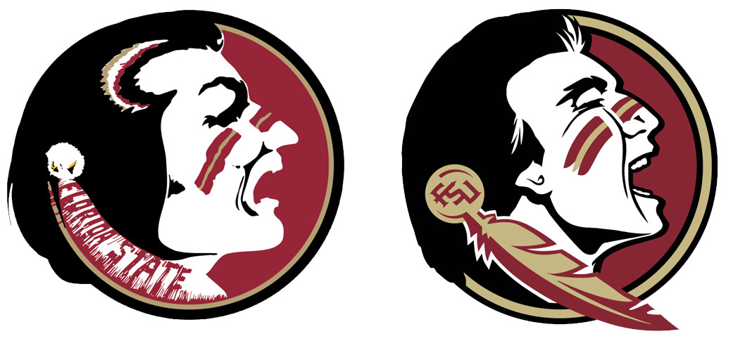
All fair points. I don’t especially like the new look myself.
But, short of the mess FSU manifested by not being transparent about their process, my guess is that the school would have faced a backlash no matter what the thing looked like.
You might not want to hear this, but the old logo sort of stunk. It was flawed in a number of ways, from sloppy line work (seriously, zoom in on the sucker if you don’t believe me) to unreproducible typography to inconsistent illustration styles from one portion of the mark to the next. It was, by all accounts, a poorly executed design.
So why are people doggedly fighting to defend it? Because people love what they know when it comes to logo design. People love what they know when it comes to any design. Previous versions of Facebook had terrible usability (it’s still terrible, but never mind that). That didn’t stop users from angrily rebelling against changes to the interface every time Mark Zuckerberg decided to make an improvement. Different is almost always seen as worse. At least at first.
Not to shortchange The Zuck’s difficulties, but logo redesign is one of the most challenging practices in all of design. People attach themselves to a logo in ways that they don’t to a website or to an advertising campaign. Whether fans realize it or not, they associate the FSU logo with their personal experiences, far past the point where they see the flawed elements that make up the design. When people see the existing FSU logo they think of the games they attended, the tailgating and, for the alumni, their time spent in class, in dorms or at parties. Deeply saturated brands that get stuck in your bloodstream are like that. They create an impression of the thing the logo stands for to such a degree that people stop noticing the design. At that point, the design, in a sense, ceases to exist.
And that’s mostly a good thing. Bad design is still bad design. You won’t find me standing up for garbage, and when a design is especially terrible, you’re unlikely to build strong devotion to a brand and the things it represents to begin with.
That doesn’t change the fact that fans of any brand, especially pro or college teams, will vehemently hate just about anything that’s different than what they know when they first see it. It takes time for people to build a sense of nostalgia for the new mark; to look past the design and see the things they’ve attached to it. We see this effect regularly with our work in logo redesign. We’ve had clients hold up crusty old magnets that featured silly clip art straight out of the nineteen-seventies and ask us to retain the “essence” of the original design. Why? Because they don’t see the design. They see the brand.
FSU’s new logo isn’t the first to upset fans. The Buffalo Sabres’ “Buffaslug” was reviled by fans when it was first released. Before the team relented and changed the logo, half of the then most popular NHL jerseys sold featured the much hated logo. All it took was a winning team to start changing minds.
The new FSU logo is not a great design. It could have and it should have been an improvement from the previous version. But it wasn’t. And that, in all likelihood, will be fine once fans have a chance to get used to it and to replace the design with their experiences. Chances are, everyone is just one or two good seasons away from accepting it, and then, in a number of years, fighting to keep it when it’s time for the next redesign.